
One day in a discussion about Covid and so-called “vaccinations” I was shown google’s Covid19 dashboard. On one hand I was amazed by the amount of data, but on the other hand, the discussion was about medical effectiveness of the shots, and the correlation between the shots and positive tests didn’t look that obvious to me. Therefore, I dug deeper.
Getting the data
As it turns out, the daily test data in the google’s dashboard comes from another dashboard by New York Times. The data isn’t unfortunately accessible in tabular format so that I could take it and play with it. The second part, however, the “vaccination” data in the google’s dashboard comes straight from Our World In Data (OWID) github page, which is just a click away from a downloadable CSV file. And once I got this file, it was just a quick look around OWID’s github to find also the daily tests data, or rather a link to it. The data itself comes from healthdata.gov.
Processing the data
If you’re not interested in technical details or repeating this analysis, skip to the next section.
I then fired up my R console and loaded the vaccination data. It is organized by state, but there is also a summarized “United States” category – I just filtered everything else out:
v = read.csv('~/Downloads/us_state_vaccinations.csv')
v = v[v$location=="United States",]
v$date = as.Date(v$date)
Then I loaded the daily testing data. It turned out too fine-grained for my purpose, so I had to summarize it by date (added up all locations) and outcome (positives, and separately totals).
t = read.csv("~/Downloads/COVID-19_Diagnostic_Laboratory_Testing__PCR_Testing__Time_Series.csv")
t$date = as.Date(t$date)

t1 = aggregate(t$total_results_reported, list(date=t$date, Outcome=t$overall_outcome), FUN=sum)
t1 = t1[t1$Outcome=="Positive",]
t1$Outcome = NULL
names(t1)[2] = "Positive_tests"

t2 = aggregate(t$total_results_reported, list(date=t$date), FUN=sum)
names(t2)[2]="Total_tests"
I then put the testing data together. I also had to calculate daily numbers as the dataset contained only cumulative totals:
t = merge(t1,t2, by="date")

t$test_daily = 372  # preserve the 1st record
for (i in 1:(nrow(t)-1)) { t$test_daily[i+1] = t$Total_tests[i+1]-t$Total_tests[i] }

t$pos_daily = 67   # preserve the 1st record
for (i in 1:(nrow(t)-1)) { t$pos_daily[i+1] = t$Positive_tests[i+1]-t$Positive_tests[i] }

# Clean-up
t = t[!is.na(t$test_daily) & t$test_daily>0,]
And finally, I merged that with the vaccination data:
a = merge(t, v[,c("date","people_fully_vaccinated", "people_vaccinated","daily_vaccinations")], all.x=TRUE)Now comes the time to make some plots – and draw some conclusions, perhaps…
Analyzing the data
I am going to post here the code for the first couple of plots, but the rest of them is going to be made the same way, so I’ll just skip the code and put graphs directly to save space.
Now, first things first: let’s reproduce the dashboard plots to make sure I have the same data as is shown in the dashboards:
# Fit a smoother to the data with low span (high jitter)
l = loess(pos_daily~as.numeric(date), a, span=0.04)

# Plot the underlying data and smoothed line, but without the x axis labels - need processing
plot(l, ylab="# of positive tests per day", xlab="Date", xaxt='n', type="h", col="#2200ee55")
lines(as.numeric(a$date), l$fitted, lwd=2.5, col="blue")

# Add nice x-axis labels
locs <- tapply(X=a$date, FUN=min, INDEX=format(a$date, '%Y%m'))
at = a$date %in% locs
at = at & format(a$date, '%m') %in% c('01', '04', '07', '10')
axis(side=1, at=a$date[at],    labels=format(a$date[at], '%b-%y'))

# Next, the shots plot:
plot(people_vaccinated~date, a[!is.na(a$people_fully_vaccinated),], type="l", lwd=2, col="#2200ee99", xlab="Date in 2021", ylab="# of people")
lines(people_fully_vaccinated~date, a[!is.na(a$people_fully_vaccinated),], type="l", lwd=2, col="blue")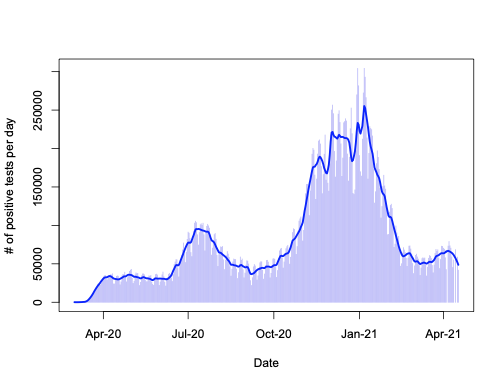
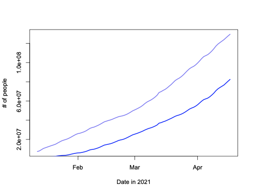
Looks pretty much like the plots in the New York Times and google dashboard for the USA (all regions) – at least to me.
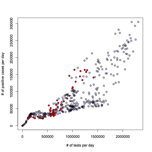
Let’s dig deeper then. I would like to first try something I always wondered about: what is the relationship between the number of tests performed every day, and the number of daily positives? Here is the answer:
l = loess(pos_daily~test_daily, a)
o = order(a$test_daily)
plot(l, xlab="# of tests per day", ylab = "# of positive cases per day", pch=21, bg="#2200aa33")
lines(a$test_daily[o], l$fitted[o], lwd=2.5, col="blue")
Honestly, I leave the interpretation and conclusion to the reader. To me this looks pretty obvious, but I don’t want to impose anything…
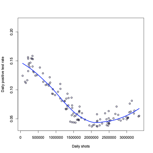
Next, let’s take on the “vaccines”:
b = a[!is.na(a$people_fully_vaccinated),]
l = loess(pos_daily/test_daily ~ people_fully_vaccinated, b)
plot(l, xlab="# of people with 2 shots", ylab="Proportion of positive tests", pch=21, bg="#2200aa33")
o = order(b$people_fully_vaccinated)
lines(b$people_fully_vaccinated[o], l$fitted[o], lwd=2.5, col="blue")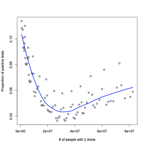
Now, if I was a Pfizer or Moderna CEO and I’m looking at this graph – I would say: see how the proportion of positive tests fall as people get immunized? This is how the shots are effective.
I am neither Pfizer nor Moderna CEO, though, so I would say: not so quickly! True: there appears to be a strong correlation, but it does not imply causation. What if the infection rate is seasonal, and the shots were started at the end of the season, when the positive cases were falling naturally? Furthermore, even in the ideal case – let’s say there is causation and this plot shows it in the first part, then what about the rise in positive cases after ~40M shots? New virus strains that are not affected by the shots?
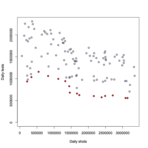
Let’s then overlay the shots totals on the daily positivity plot to see if the changes coincide in time. In practice these numbers are in very different scales, but I don’t care about the scales, just want to compare the starting point. For better visibility I also added a vertical line (gray) at the point where the information in the “vaccination” data set begins.
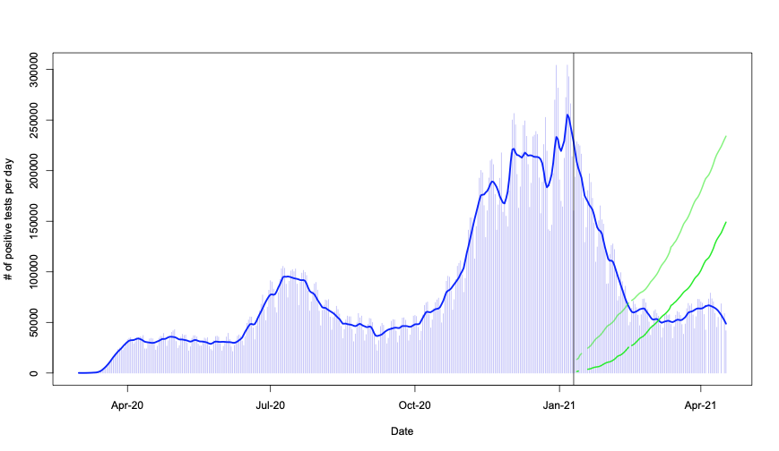
In practice, the above is just a combination of the first two plots in this post – with common x axis. It really does seem that the drop in positivity coincides with the beginning of shots. It almost appears too good to be true – with virtually no lag and huge effect…
Quirks in the data
Remember that plot of positivity rate vs total number of people with two shots? Guess what those red points have in common?

These are all… Sundays. All Sundays are marked red in the above graph. What conclusion does that lead us into? I’ll leave that to your creativity.
Further analyses
A few other things I wanted to explore graphically:
While all this is interesting, there still remain many open questions that are crucial to the interpretation of these results:
- Question always number 1: how reliable is the data? Are there errors, omissions, etc?
- Will the data change in the future?
- What do the tests actually detect?
- What does a “positive” test result actually mean in practice?
- Are we seeing seasonal and other effects here or just the effects of the shots?
- And many others…
And lastly, coming back to the proportion of positive tests:
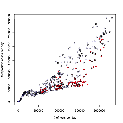
The Sundays are highlighted just for fun, but there is something curious about the plot on the right – with highlighted points since the shots were started.
Anyway, it would be useful to explore this also for other countries and see how this looks like. Someday.
Recent Comments